My take on AI Scale: We’re forgetting about the demand-side of the market
We’re all grappling with the same mess of existential dread. Job replacement, cyber warfare, artificial general intelligence, economic meltdown – there’s a mess of new problems that inevitably will come to pass if AI continues to scale in capability and agency. If you’re like me, you’ve sunk down the rabbit hole of anxiety about where this all leads.
To grapple with these anxieties, I’ve recently started going for daily walks in my neighborhood, where I engage in the joys of analog things. On one of my recent walks, it occurred to me that while I do believe that the technology itself has astronomical potential, there is a distinct difference between what this technology CAN DO, and what users will PAY FOR IT TO DO.
The level of investment that we’re seeing dumped into AI doesn’t come from investors that believe in the power of AI to derail capitalism (ICYMI - Elon told The Economist that he believes that money will become irrelevant by 2036). It comes from investors who believe they’re going to make more money than anything they’ve ever bet on before in their lives.
In order for these investors to see the kinds of returns they’re expecting from the AI race however, we need to remember that not all users will pay infinitely for all tasks to become automated by AI. There will be diminishing returns on where AI is worth the cost, and where they will need to continue to rely on human labor. We haven’t hit the line yet, and therefore the ambiguity as to where this line lies, across different industries and consumer markets, is what’s causing panic in the labor market.
As different markets find this line for themselves, we’ll begin to truly understand what the actual financial return will be for AI, and where marginal gains to productivity can truly be found. This is clearer in some markets than others, as Anthropic has already begun to predict – and as we see AI begin to be paired with supplementary technologies like robotics, this AI coverage will begin to expand.
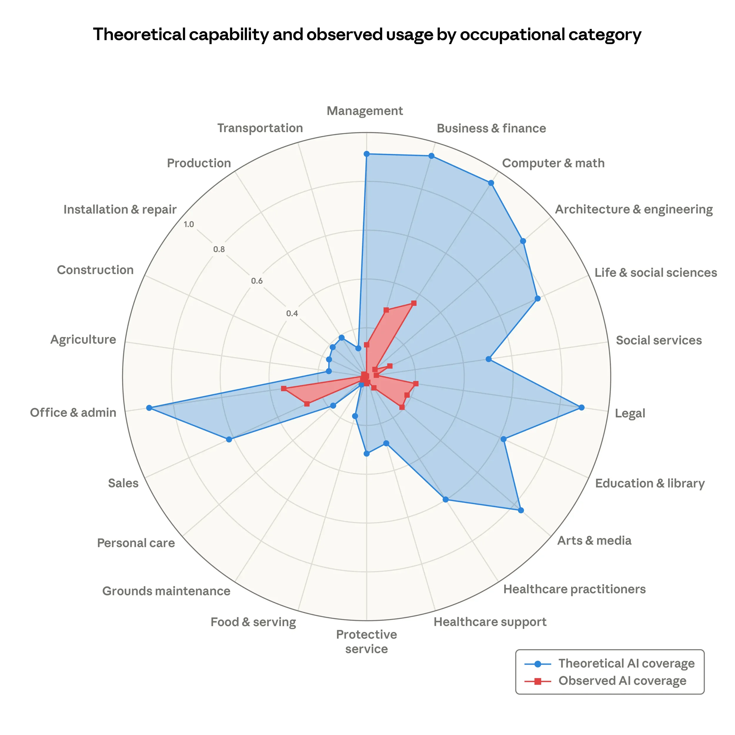
But this prediction really only covers AI capability, it hasn’t tested what industries and markets will pay for, and where that demand will stick as cost increases. It’s tempting to assume that all industries will want to automate entirely, but without understanding the nuances of their businesses, and the many variables involved, this becomes a risky assumption. Consider such variables as data privacy restrictions, which could impact industries like Healthcare and Legal, or consumer market preferences, which could impact the Arts & Media industry if, for example, we saw users push back on AI-generated films and music. These aren’t trivial, and they’re not problems that you can simply ask the AI to solve around. They require policy changes, or massive power over consumer demand, that not all firms possess.
We’re already seeing consumer AI usage behavior change and respond to competitive pressure. ChatGPT once considered itself the standard bearer and proof point for where user adoption of AI was trending, but as usage stats have begun to slow, we’re now beginning to see that the market is sticking to where they can get the best product value, for the best price.
Anthropic and Google are taking great advantage of this. Anthropic was slower to market with Claude Code, but introduced it when it offered a truly differentiating power that has absolutely transformed the software engineering market in a historical way. Instead of chasing the consumer adoption trend, they waited to introduce something that enterprise businesses now can no longer afford to live without. That means - they’ll pay for it.
Meanwhile, for standard consumers, Gemini offers similar features as ChatGPT that existing Google Suite users don’t need to pay extra for, unless they want premium features. This allows them to leverage AI as a Google Suite product value deal sweetener that strengthens their user base adoption and preserves their audience size.
As economic pressures become tighter in 2026, users will all begin asking themselves – can I really afford to pay for a premium AI chatbot? Do I really need to pay for these features? Once that mirage of differentiated product value begins to evaporate, so too will our imagined revenue gains from AI.
This is why the B2B / Enterprise play for AI adoption is the shining light for revenue growth – Anthropic learned this well with Claude Code, and it’s why they’re thinking critically about where AI implementation can inflect the right businesses critically (Read about their partnership with Blackstone to launch Ode). Finding those inflection points is critical to preserving lasting revenue gains from AI.